Backgrounds and Motivation
Greenhouses gases, such as carbon dioxide and methane, exist in the atmosphere and keep warm air near the Earth’s
surface. Human activities, notably fossil fuels consumptions, industrial construction, deforestation, etc., over the
past century have been causing the amounts of greenhouse gases in the air to skyrocket, trapping an excessive amount of
heat around Earth. Climate scientists believe that global warming is mainly caused by human activity. Through this
project, we aim to dive deeper into the relations between human activities since the 1960s and global temperature rise.
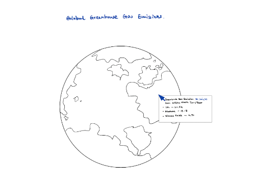
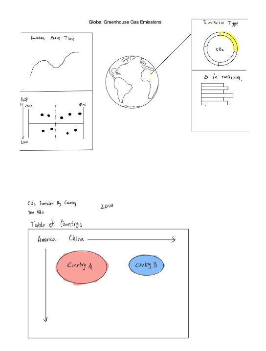
Orginal Sketch
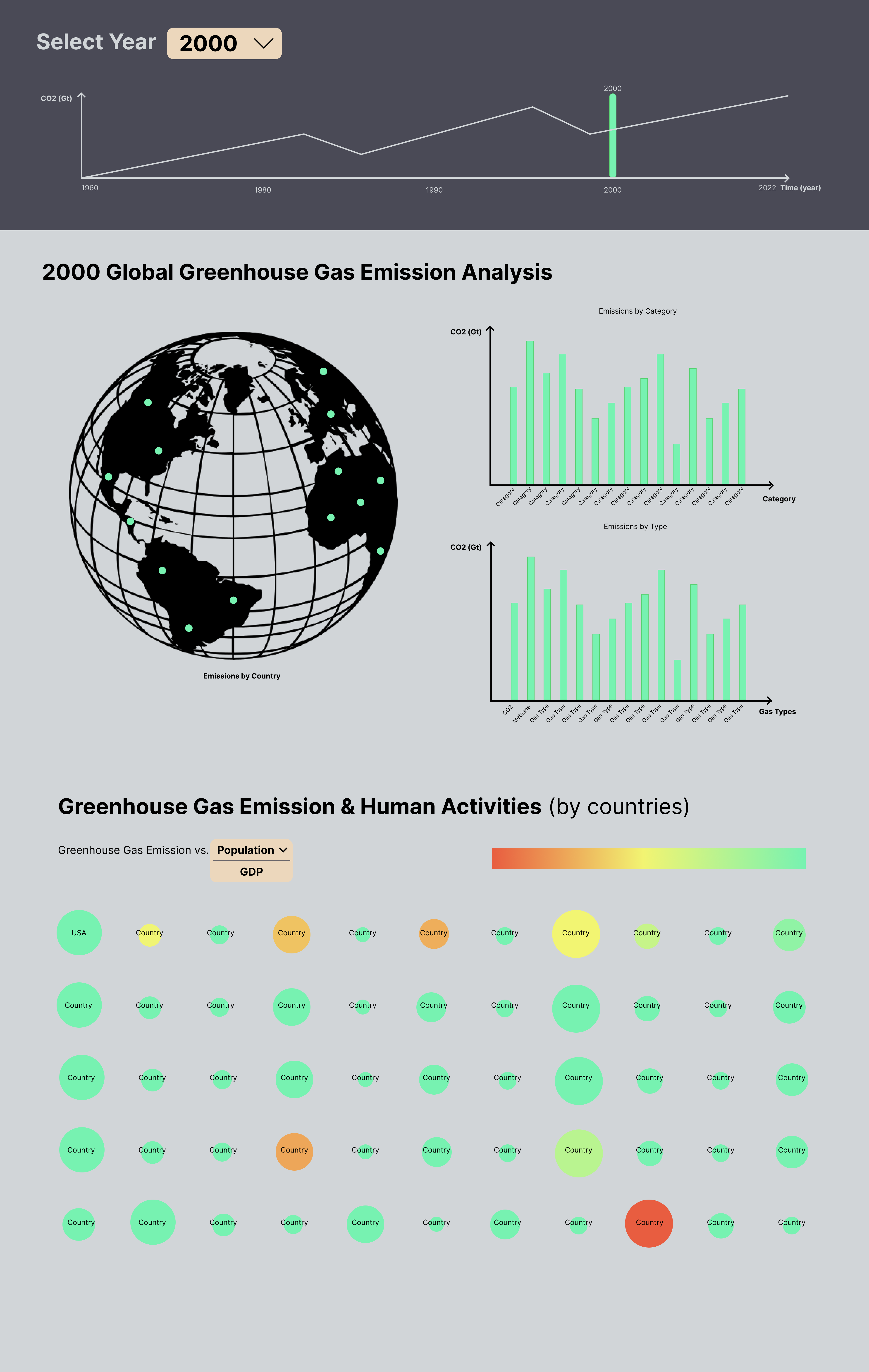
We’ll display our data as shown in our final design above. First, our visualization will have a fixed Global Greenhouse
Emission vs. Time line graph on the top of the page, serving as time slide for the rest of the visualizations. The line
graph will explore global greenhouse gas emissions over the years, answering primary question #1. Furthermore, we’ll
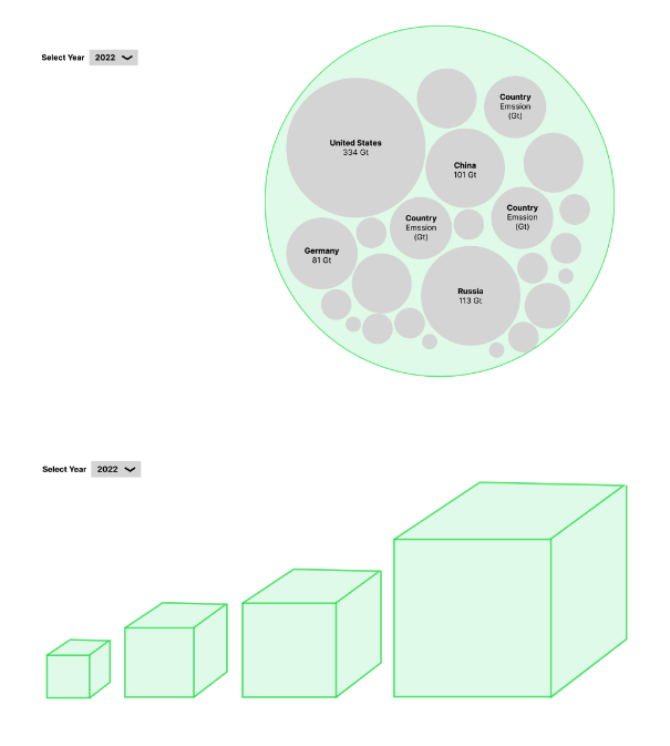
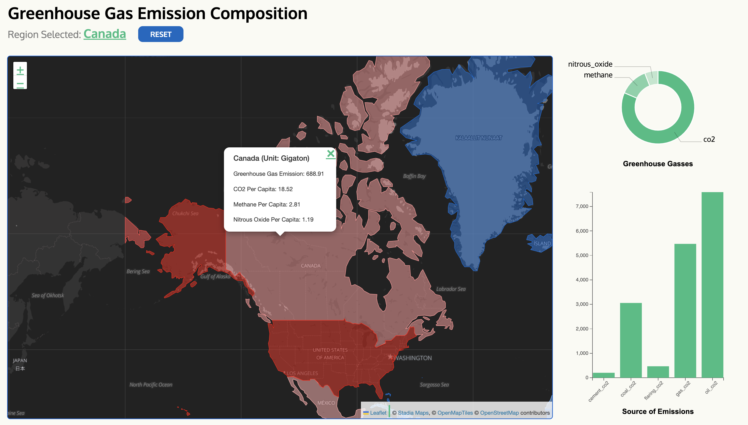
display each country’s greenhouse gas emission in the selected year via a globe view. The globe visualization will use
color gradient to compare and contrast the extent of each country’s greenhouse gas emission, thus answering primary
question #2. Users can also select a specific country on the globe visualization to further investigate that country’s
greenhouse gas emission, which will be shown in the Emission by Category graph and Emission by Type graph to the right
of the globe visualization, consequently addressing primary question #3.
Below the glove visualization, we will investigate the relationship between human activity and greenhouse gas emission
by illustrating Greenhouse Gas Emission v.s. Population graph and Greenhouse Gas Emission v.s. GDP graph. Each country
will be represented with a text label of its name. The size of the circle will represent the amount of greenhouse gas
emission, and the color of the circle will represent a human activity indicator (Population or GDP) based on the user’s
choice. Such design will enable users to further examine each country’s contribution to greenhouse gas emission.
Exploratory Data Analysis
- What visualizations did we use to look at the data initially?
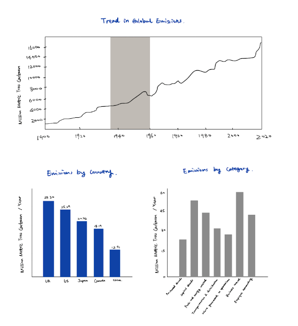
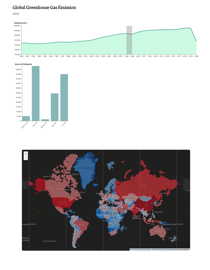
We first tried using bar graph for the emissions by year chart. We also implemented a small bar graph for CO2 emissions
by source and a world map with color layers using GeoJSON to inidicate intensity of emission in each country.
- What insights did we gain? How did these insights inform our design?
Bar charts are better for size comparision while line charts are more ideal for showcasing change in trend across time,
so we ended up replacing the emissions by year bar chart with a line graph. We also added a fixed size brush for user to
select the specific year they want to view.
Milestone 1
- What questions are we trying to answer?
We are trying to answer the following three questions through our visualization: During what time frame in the past
thirty years did greenhouse gas emissions increase the most? Which countries have contributed the most to greenhouse gas
emissions in the past thirty years? What are the main sources of greenhouse gas emissions?
- How did these questions evolve throughout the project?
Up till milestone one, we have completed data acquisition, data filtering, and the overall structure of our site. We
acquired a JSON dataset for global-wide greenhouse gas emissions data by country and year. We created our charts as
objects and implemented the "initVis(), wrangleData(), updateVis()" pipeline for each one of them.
- What new questions did we consider in the course of our analysis?
As we began to design the charts, we thought about multiple ways to organize the navigation and layout of the site.
Since we are categorizing both by location (countries) and year (1990 - 2020), we need to find a method (slider/time
chart) to control these variables so that all the information can be showcased in an organized and precise way.
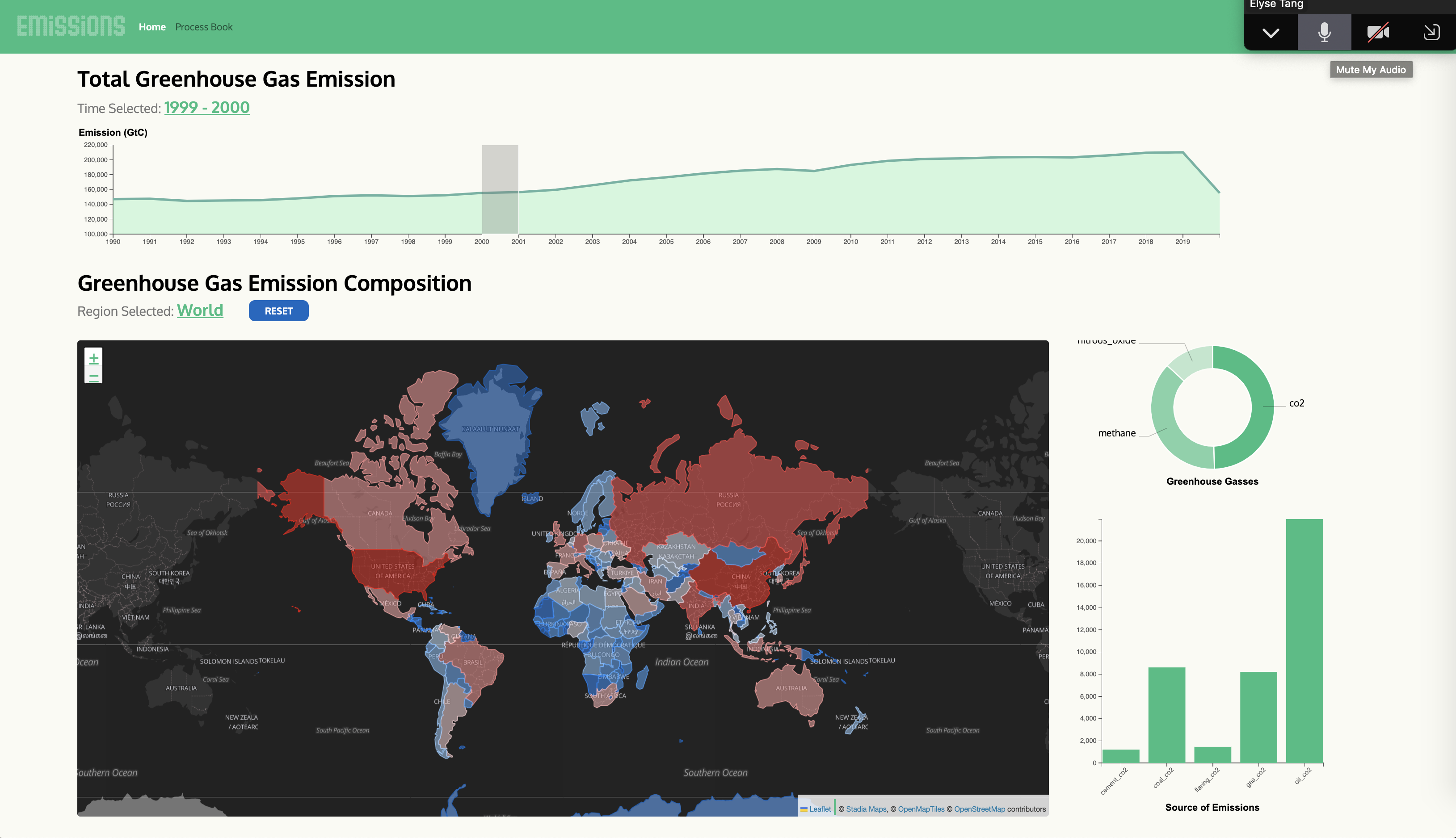
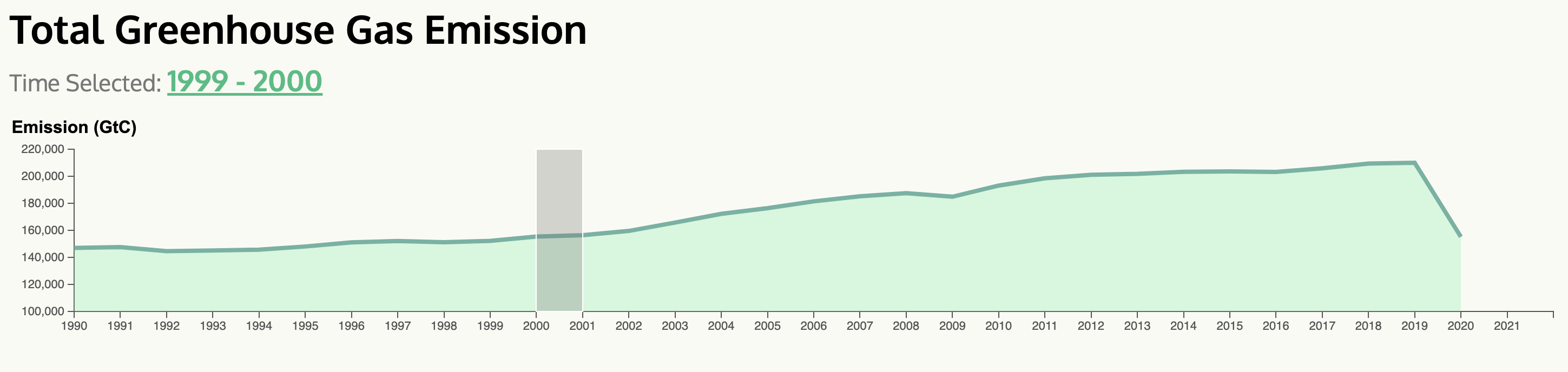
In our first prototype, we decided to use a line graph with a fixed-size brush for year selection and a global map for
country selection. These two graphs serve as the primary control units for the entire site. We have yet to hook up the
map with the other graphs, but the expected behavior is that the users can choose to view the emission data for a
specific year or country.